
Visualizing results in jinkō
Context & main goals
This tutorial assumes that you have already created and launched a trial in jinkō. Should you not have completed this step, you can refer to the following link:
Basics
All plots are generated using Plotly graphics. At the top of each chart, you'll find icons with functions that allow you to interact with your charts. For more details on these functions, please visit the dedicated web page

Zoom-in and Zoom-out/Autoscale the plot
To zoom in on a section of your plot, it's easiest to click on the Zoom mode in the options bar at the top right of your plot, then click and drag the mouse over the plot to zoom in. You can then double-click to zoom out.
Zoom-in along axes
To zoom along only one axis, click and drag near the edges of either one of the axes. Additionally, to zoom-in along both the axes together, click and drag near the corners of both the axes.
Pan and Reset the plot
If the plot's drag mode is set to `Pan`, click and drag on the plot to pan and double-click to reset the pan. To Pan along one axis, click and drag from the center of the axis. Double-click on a single axis to autoscale along that axis alone.
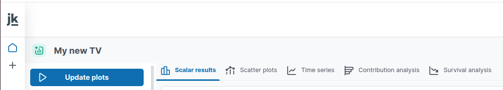
Visualize results
Create a new trial visualization
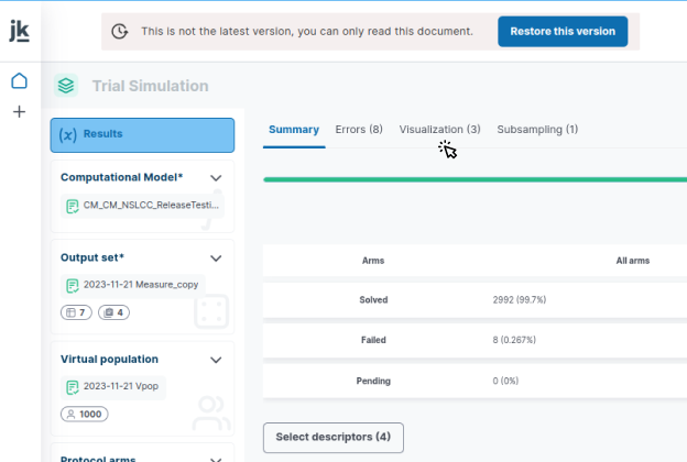
You can start visualizing your trial’s results by clicking on the `Visualization` tab in your Trial Simulation panel
You can either create a new trial visualization or explore an existing one.
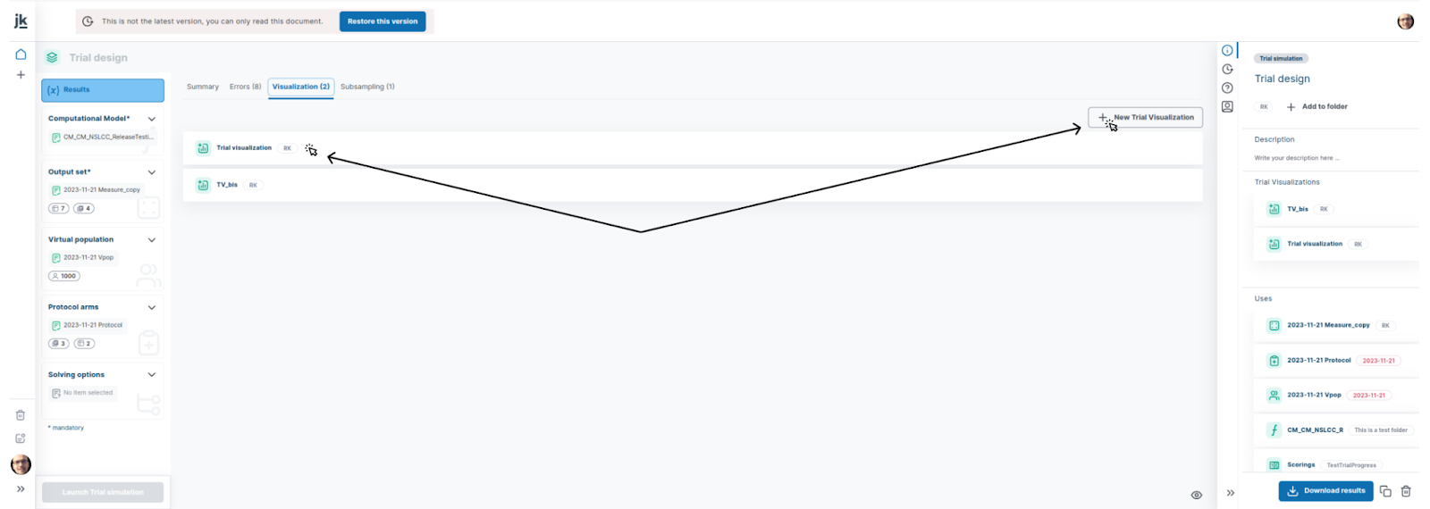
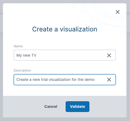
By clicking the `create visualization` button at the bottom right of the `Visualization` tab, you will be asked to provide a name and description (optional) for your visualization.
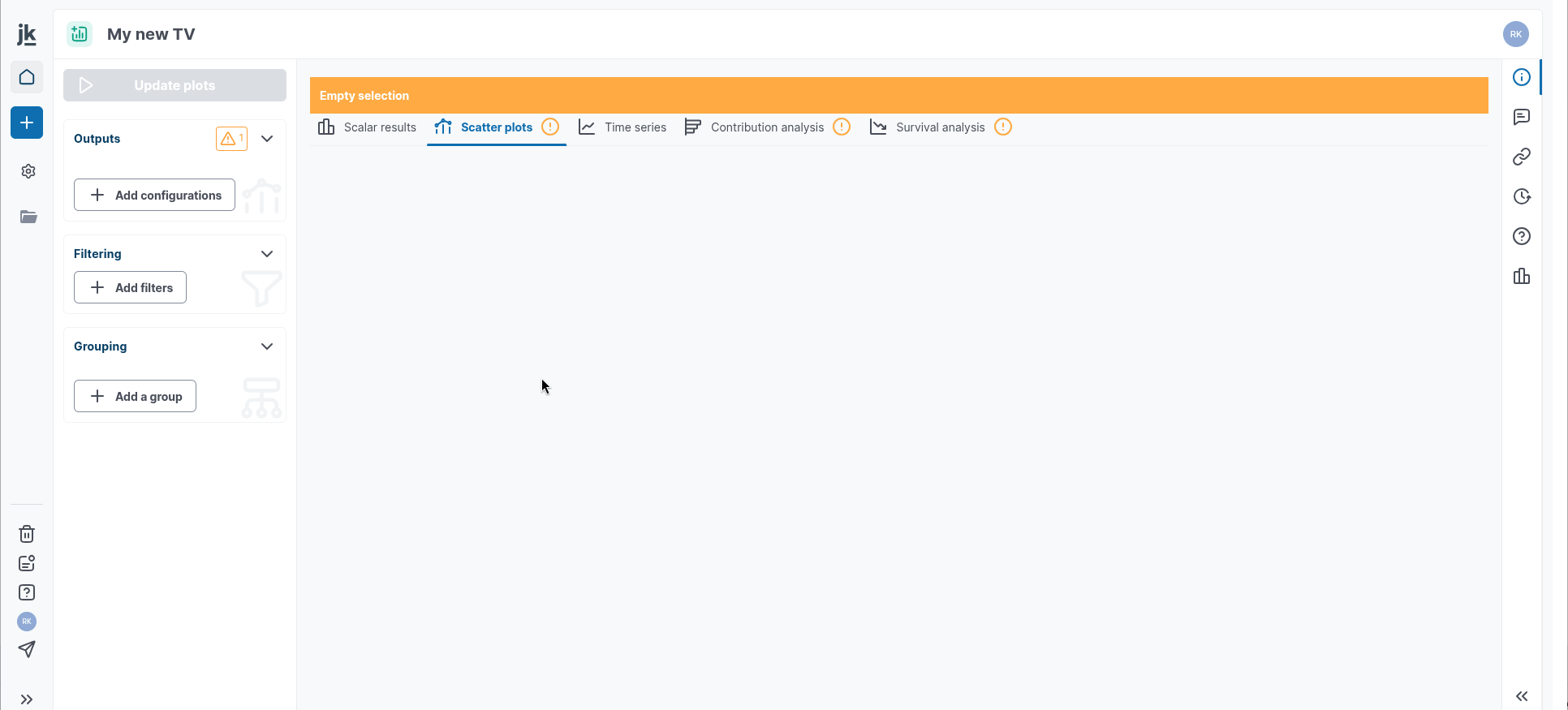
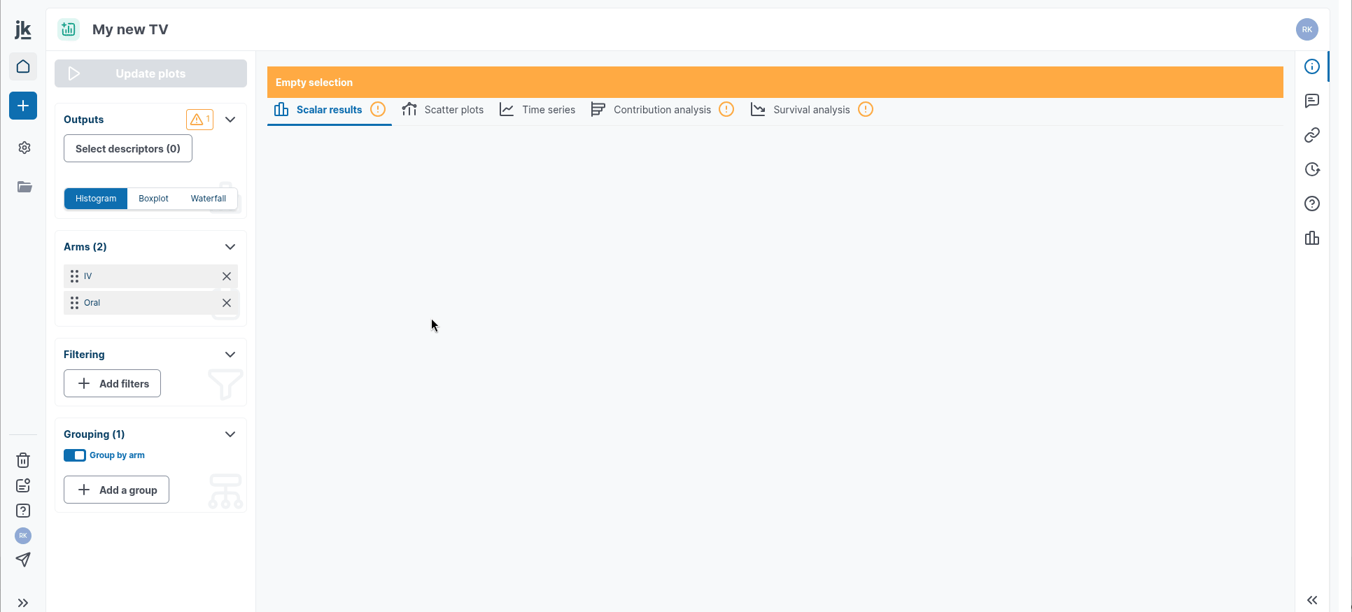
A new item 'Trial visualization' is thus created and the `Visualization` interface appears. By default, the outputs selected and/or created in the `Trial Simulation` editor will be automatically displayed in the `Trial Visualization` panel, according to their nature and type, in different tabs. However, setting up variable pairs for Scatter plots is required.
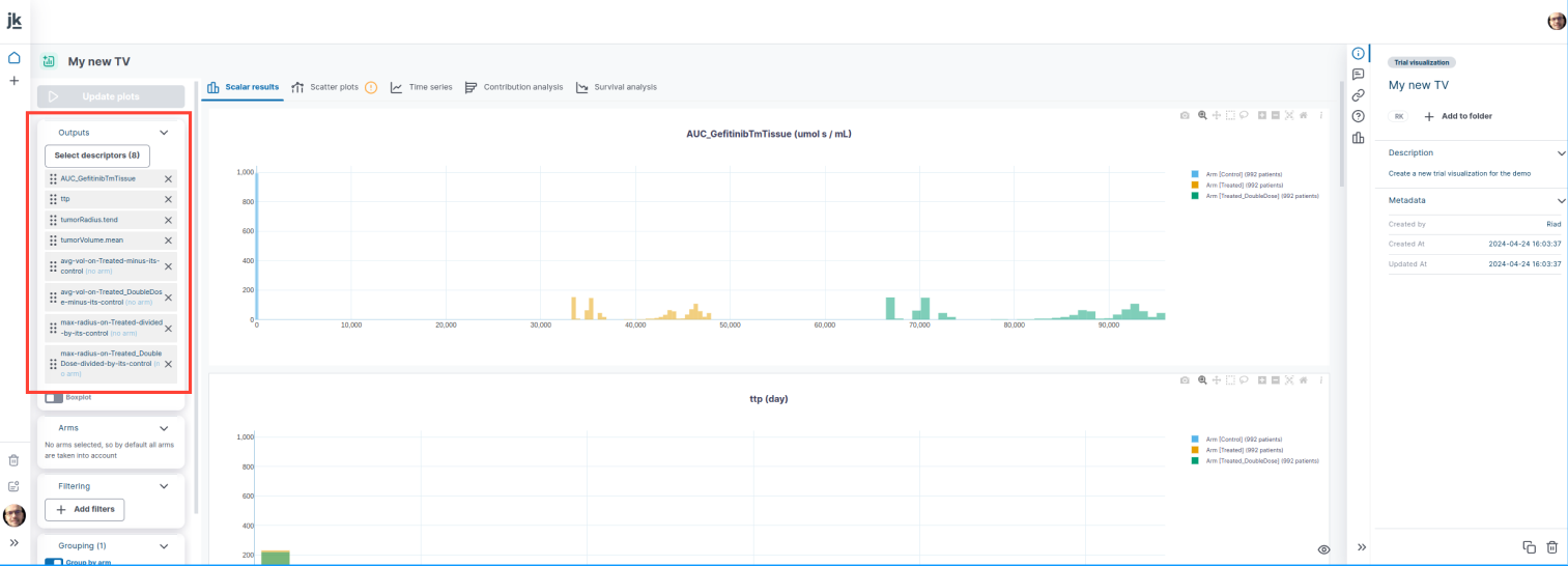
Scalar Results: they represent a snapshot of the distribution of model’s variables at a given moment in time. For instance, outputting the tumorRadius at t.max will give you the distribution of the virtual population according to the projected radius size of their tumor at the end of the simulated trial.
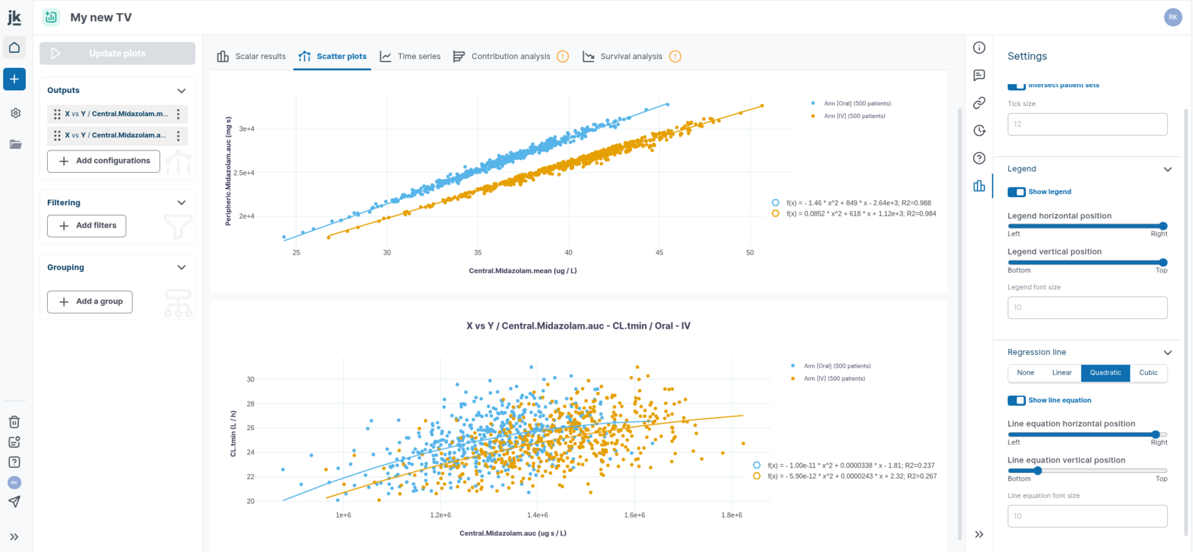
Scatter plots allow for the representation of the relationship between two numeric variables:
The `X vs. X` plot allows you to compare a variable in one reference arm with the same variable in one or multiple other arms. This option can be used to represent the well-known Effect Model.
`X vs. Y` plot allows you to show the relationship between two different variables stratified by arm.
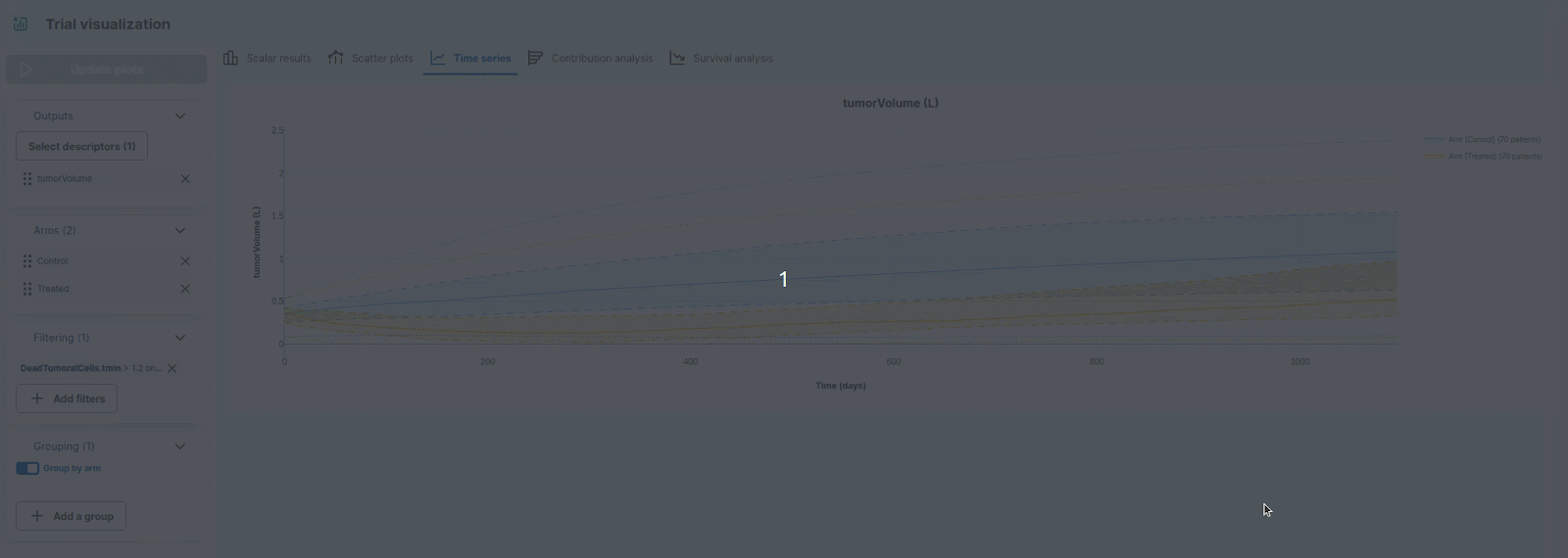
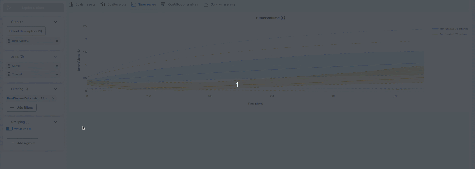
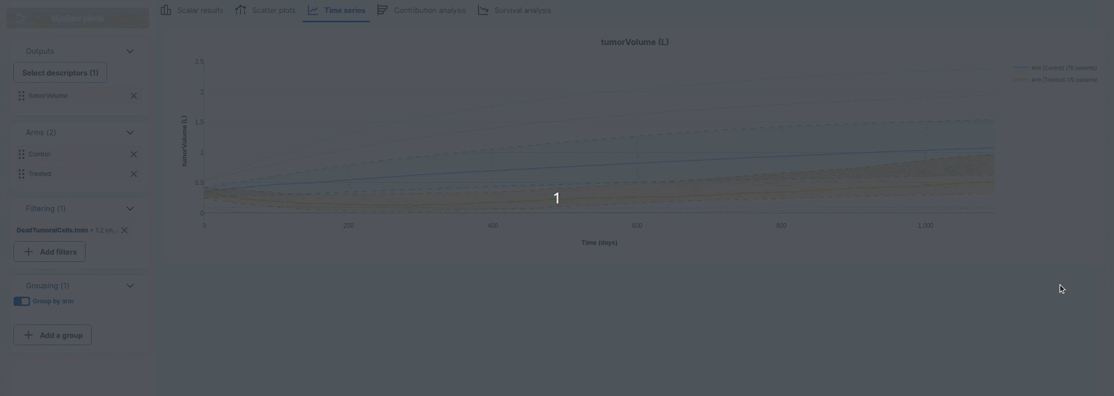
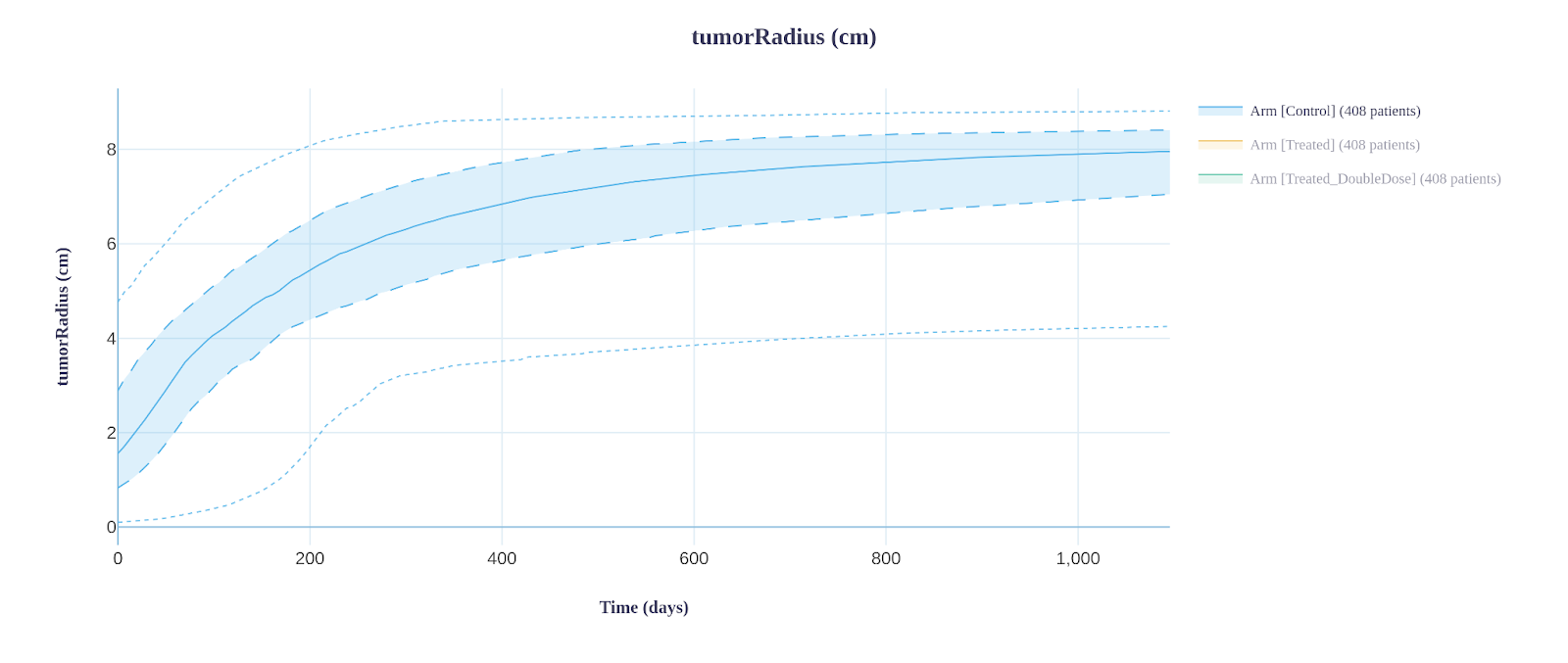
Time Series: show the evolution of the selected clinical output(s) over a given time period, which is the t.max selected during the configuration step of your trial. Note that you can change the time scale on the right side app-panel.
Advanced analyses: you can also perform a contribution analysis (identify and order the impact of the variables on the outputs of interest) and a survival analysis (Kaplan-Meier curves with numbers at risk tables and statistical tests (log rank)).
Each time you make a change to your graphs or descriptor list (see below for options), you need to click on the `Update plots` button.
Create scatter plots
You can create as many configurations as you like.
In the left-hand panel, in the `Outputs` card, click on `Add a new configuration`. A window appears. You can choose one of two types of scatter-plots: `X vs. X` or `X vs. Y` :
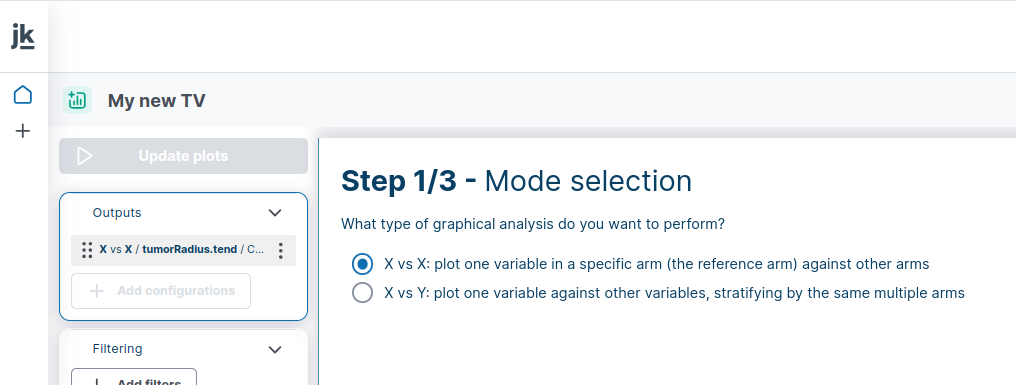
Create a `X vs. X` plot.
Step 1: select `X vs. X` option
Step 2: Select the variables that you want to display. `X vs. X` will only work for scalars with arms. You can add or remove filters or search by names.
Step 3: Select the reference arm to use for the X axis, then select the arms you want to use for the Y axis.
Click on “Validate”, a summary window will appear with your configurations.
Click on the “Update plots” button
Create an `X vs. Y` plot.
You can do this either in the same way as for the creation of a `X vs. X` plot, or by using the edit function. Let's do this by editing an existing configuration.
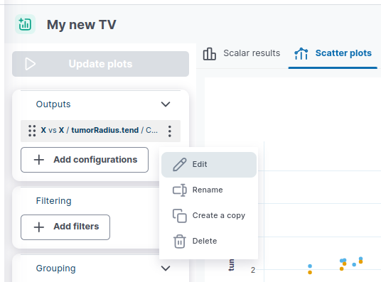
Step 1: Click on the ” ⁞ “ button to make the menu appear, then click on “Edit”, and finally on the “Previous” button to change the type.
Step 2: select your x variable. `X vs. Y` scatter-plot supports cross-arms variables
Then select as many variables you wish. Note that X variable can be selected as Y variable in this case.
this will create as many configurations as selected Y variables
In time series, the Settings panel allows you to add a regression line to a single plot or all plots. You can select from three types of regression fitting: Linear, Quadratic, or Cubic. The equations and their parameter estimates can be displayed or hidden as needed.
Plot scalar results
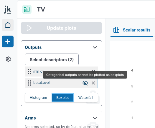
You can select your Outputs you want to display in the "Outputs" card in the left-hand panel. You can switch between histogram/barplot diagrams, boxplot representation and waterfall chart.
Note that categorical variables can not not be displayed as boxplot or waterfall
Plot time series
First, select or modify the list of descriptors of interest in the "Outputs" card in the left-hand panel. A window appears, allowing you to add descriptors you would like to see displayed. You can search for your variables by scrolling through them, or by filtering them using the search bar and predefined filtering options.
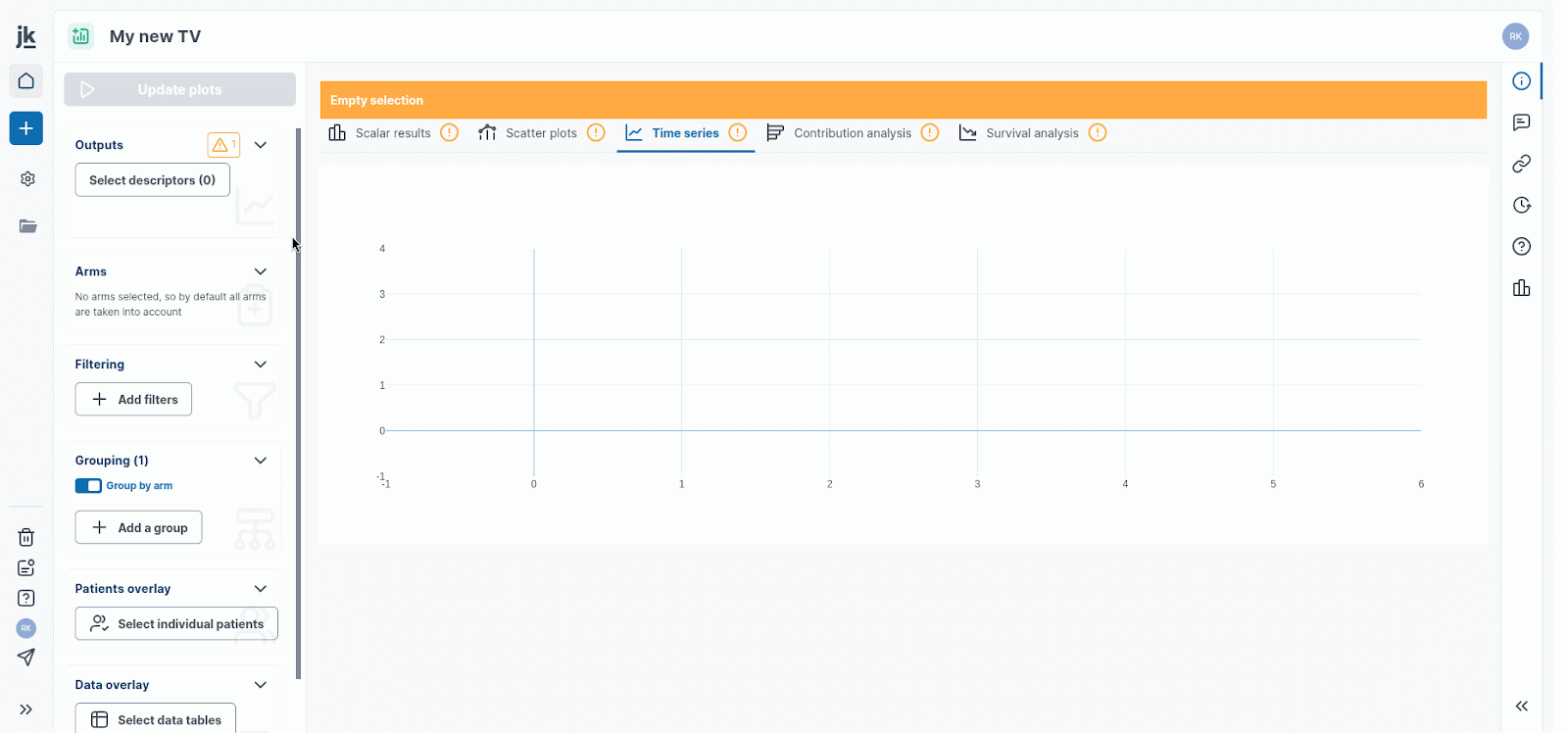
Patient Overlay
To analyze specific virtual patients, first define their key characteristics by selecting relevant baselines, outputs, and the specific treatment arms, then visualize their individual data by overlaying it on the output plots for comparison and further analysis.

Data Overlay
The Data Overlay feature allows you to import external data into the platform. Please note that only datasets compatible with the calibration data format are supported.
When a data table is uploaded, an automatic mapping of variables and treatment arms is performed. A built-in sanity check identifies any mismatches between observed (imported) and simulated data, which may occur in variable names and/or treatment arm names. The reference list of variables to be mapped is the list of TV Outputs.
In the Data Mapping modal, you can review the details of the variable mapping, along with any associated warning messages.
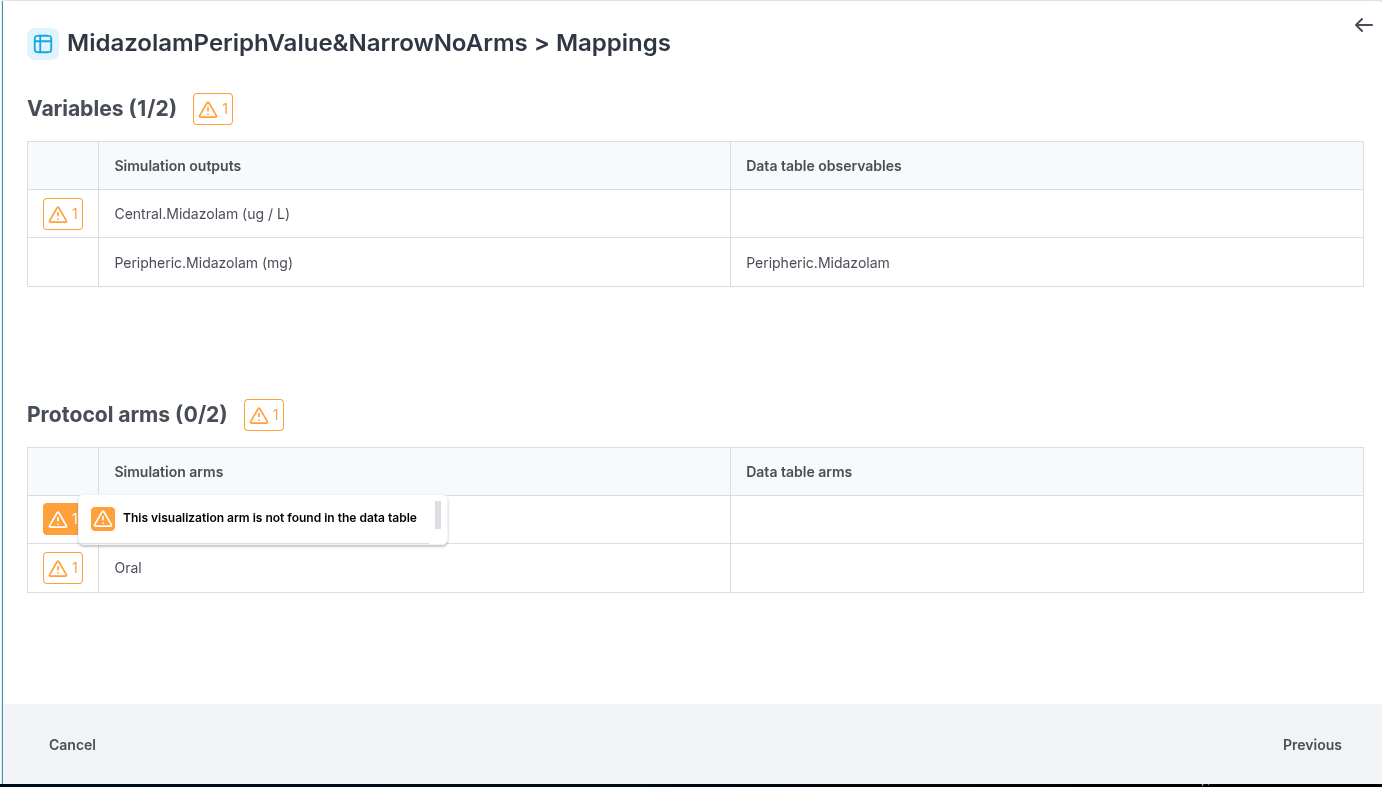
You can overlay multiple data tables for each output as needed.
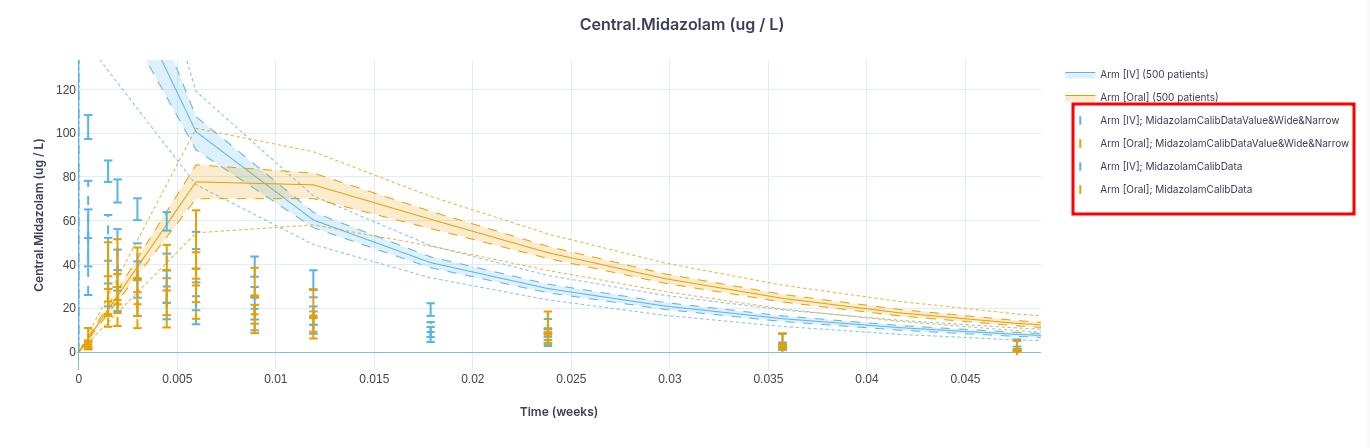
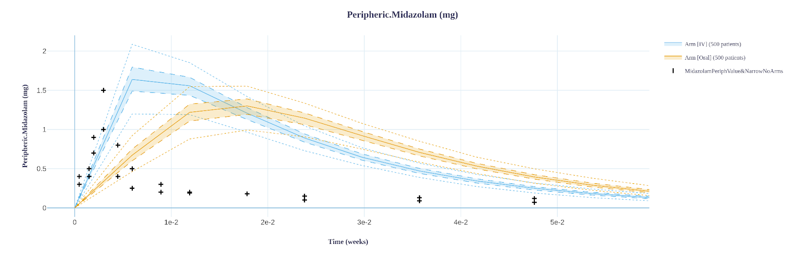
Data are stratified by treatment arms, with each arm displayed in a different color. For datasets without treatment arms, If the visualization is grouped by arms, the raw data will appear in a neutral color (black - see below). Otherwise, it will use the same color as the simulated dataset.
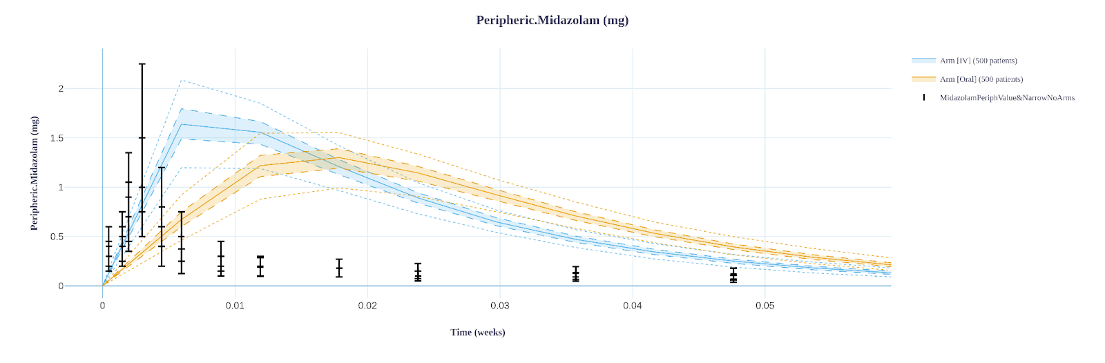
You can toggle the display of data ranges (wide and/or narrow) if they are available. Each range is represented by bars with distinct line styles (dashed or solid).
The GIF below illustrates the entire data overlay process:

Advanced analytics
Contribution analysis
You can analyze your trial results by evaluating the contribution of the patient baseline descriptors on any quantity of interest using tornado plots. Details on how to analyze the contribution of input descriptors on simulation outputs (with a tornado plot) can be found here.
Survival analysis
Allows to compute and visualize survival curves, with patients at risk tables, cumulative hazard rates, and log-rank tests. Details on how to run and interpret a survival analysis can be found here.
Data settings
In the visualization, subgroup analyses are facilitated by the possibility to filter or group your virtual patients.
Select arms
By default all protocol arms are used to stratify plots (patients are grouped by arm). However, you can manually select the arms you wish to display either by using the arm selection tool (which will apply to all visualization tabs except the scatter plot), or by individually deselecting unwanted arms in the legend of a specific graph.
Arms selector:
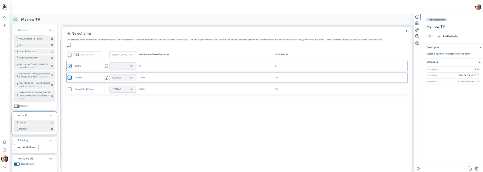
Labels:
Filtering
If you wish to focus on specific sub-groups, you can use the filtering option. The final result of filtering is the combined effect of all the created filters. The individual effect of each filter can be evaluated in the filter tool window, either visually or via a summary table.
To create filters:
Click `Filtering` in the left panel. The `Filtering` tool window appears.
Click `Add a new filter`
Configure your filter by selecting the variable of interest, then the target arm and finally the condition and the threshold value
Close the window and click on `Update plots` to apply your filters
Note that if a filter excludes a patient, it will exclude it from all arms. Additionally the `Intersect patient sets` option might further exclude patients if the values plotted cannot be computed for all arms.

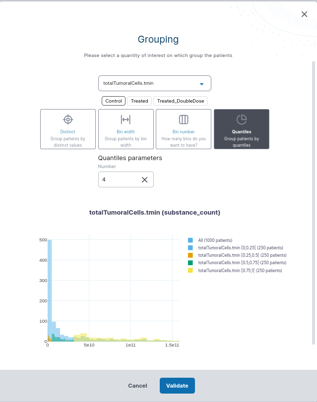
Grouping
Click on `Grouping` in the left panel
Select the variable of interest to group by and the reference arm from which you wish to produce the groups.
4 methods are available to create your groups:
: each unique value of the grouping variable is considered as a group.
: requires two parameters: the size of the bins and the value of the offset. The size defines the exact width of the bin, the offset sets the left bound of the first bin. The number of patients per bin varies.
: data will be split into as many groups as requested. The groups will have the same automatically calculated width but not the same number of patients.
: allows to divide the data into as many quantiles as you want. Eg.: if the number of quantiles is 4, the data will be divided into quartiles: [0-25%[, [25%, 50%[, [50%, 75%[, [75%, 100%]. In this example, the first quartile (Q1) is defined as the 25th percentile where the lowest 25% data is below this point. If the number is set to 100, the data will be subdivided into 100 groups each containing 1% of the data, called percentiles. The groups will have the same number of patients but different widths (if viewed in unit of the variable)
Plot options
To improve the reading of figures in the platform or for their export, options for plots, legends and additional customization parameters are available.
Two ways to customize your plots are available: general and specific configurations.
Specific settings
To change the layout of a specific graph, click on the `i` option in the top right-hand plot bar.
You can then modify, for the selected graph: the title, axis labels and font, legend position and text font and select to either show or hide the legend. Note that:
You can restore the default layout of this figure by clicking on the clock-shaped reset button.
Specific changes take precedence over general changes: i.e. if a specific change is made first, it will not be overridden by the general changes that follow, unless the specific configuration is reset to default layout.


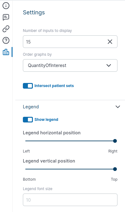
General settings
There are common options for all visualization tabs, as well as more specific options. Click on icon 
Common options
`Intersect patient sets`: if enabled, for each plot, if a value is unavailable for a patient in one arm (because of a solving or post-processing error), the clones of that patient will be excluded from all arms to keep the set of plotted patients identical across arms.
General legend setting: you can show or hide the legend and change the legend position and text font.
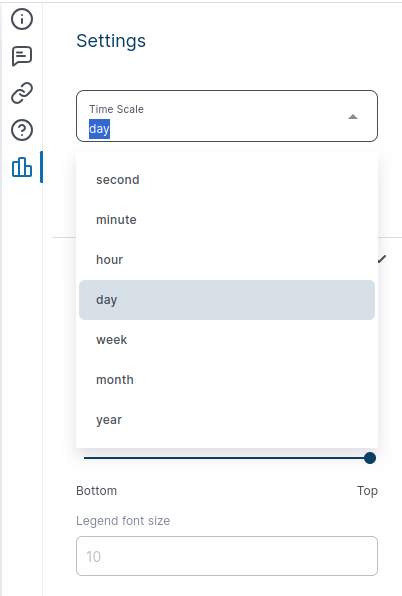
Time scale for Time-series and Survival analysis
Time scale: you can set the time scale to seconds, minutes, hours, days, weeks, months or years.
Contribution analysis setting
The Contribution Analysis shows you the most impactful input descriptors on a quantity of interest. You can choose how many of those most impactful descriptors will appear in the Tornado plot. Figures can be sorted by quantity of interests or groups.
Reply
Content aside
- 2 yrs agoLast active
- 88Views
-
1
Following